Google Plus Redesign: What’s New with Google+
Google Plus Redesign
What’s new with Google Plus Redesign?
For a brief summary of the Google Plus Redesign click the image on the left.
Now let’s take a closer look at the specific new and exciting updates to the Google Plus redesign:
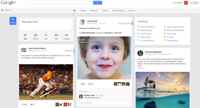
1) Multiple Columns
This Google Plus Redesign feature is dependent on the size and orientation on the screen from which Google+ is viewed. However under the changes users of the social media platform can now see one, two, or even three columns of content on their main stream, personal pages and also on Google+ business pages. The multi column redesign style is very similar to the style which Pinterest uses.
2) Animations
Users of Google+ may have already noticed that a large amount of the platforms features are now animated, which has dramatically increased the platforms intractability. An example of this is that now the sidebar navigation slides out from the left when you hover your curser over the icon on the far left, or that the Sharebox now bounces towards the centre of the screen.
3) Stand-alone Hangouts App
As part of the updates to Google+, the platform has transformed hangouts into a free stand-alone application. The app includes: text, photo sharing and also the live video feature traditionally associated with Hangouts. The new app is available on the following formats: Android, IOS and desktop.
The Google Hangouts feature has been revamped, in-line with the changes. Featuring richer and more responsive messaging, detailed conversation histories, notifications which sync across all devices, and of course free face to face conversation. The app is available from the use Google Apps avenues including: the App Store, Google Play, and the Chrome Web Store or via Gmail or Google direct.
4) New Photo Features
The Google Plus Redesign updates features a wide range of new photo features which include:
- The automatic creation of an animated sequence of photos, or grouping individual photos into a single collage.
- Automatically highlighting higher quality photos, and removing duplicates, blurry images and images with poor exposure.
- The platform now automatically backs up all of your photos from your mobile devices as you take them.
- The platform automatically touches up your photos, improving elements such as the brightness or contrast.
5) Larger Sized Media
This change is extremely similar to the starred content on Facebook. Users of Google Plus will notice that certain media content, such as photos or videos, will cover the full width of the Google+ stream. Despite these changes, it is unclear which “cards” (i.e. the individual posts resembling titles, or “cards”) are featured more prominently on the feed, and unfortunately this is something which seems to beyond the control of individual publishers or page admins.
6) Related Hashtags
Prior to the redesign, critics of the platform argued that it lacked depth. Users were able to scroll up and down in order to scan posts; however they lacked the ability to scan posts in order to explore a particular topic in more depth. The redesign eliminated this problem by automatically attaching social media hashtags to all shared content.
Google will assess your content, decide what it is about, and then hashtag it accordingly, after which it ranks relevant conversations across the entire platform. Users have the option to add their own hashtags, and to remove the Google selected hashtags, at their discretion.

