Yahoo New Logo: Thirty Days and Thirty Nights Later
Yahoo New Logo

The Yahoo new logo was announced through a blog post written by Kathy Savitt, Yahoo’s chief marketing officer. The blog was published on September 5th 2013, in the post Savitt stated, “We’re excited to share the new Yahoo logo with you. It will begin appearing across Yahoo properties globally tonight.” The Yahoo new logo which appeared on Yahoo’s homepage early in the morning of Thursday September 5th, features number of recognisable facets from the search engines previous logo. These facets include Yahoo’s trademark tone of purple and the exclamation mark at the end of the logo. The logo redesign marks the first time that the logo has been changed since 1995.
Savitt provided a further explanation for the Yahoo new logo design. In the blog post she announced, “We wanted a logo that stayed true to our roots, (whimsical, purple, with an exclamation point) yet embraced the evolution of our products.” The most notable difference between the new logo and its predecessor is the font which has been used in the new logo. Notably, the font used in the new logo is far more streamlined and makes use of the iconic Sans Serif font type.
The decision making process behind the Yahoo new logo was unveiled in a blog written by the search directory CEO, Marissa Mayer. The blog can be read by clicking here. Mayer stated in the blog post, “We knew we wanted a logo that reflected Yahoo — whimsical, yet sophisticated. Modern and fresh, with a nod to our history. Having a human touch, personal. Proud.” Notably Mayer was keen to break from the use of straight lines in the new logo. Straight lines had featured heavily in the previous design. She explained this choice in the blog post, “We didn’t want to have any straight lines in the logo. Straight lines don’t exist in the human form and are extremely rare in nature, so the human touch in the logo is that all the lines and forms have at least a slight curve.”
Mayer’s blog post reveals that the search directory had played with the idea of utilising both upper and lower case lettering in the logo. She explains why block capitals was settled on for the final design, “we toyed with lowercase and sentence case letters. But, in the end, we felt the logo was most readable when it was all uppercase, especially on small screens.”
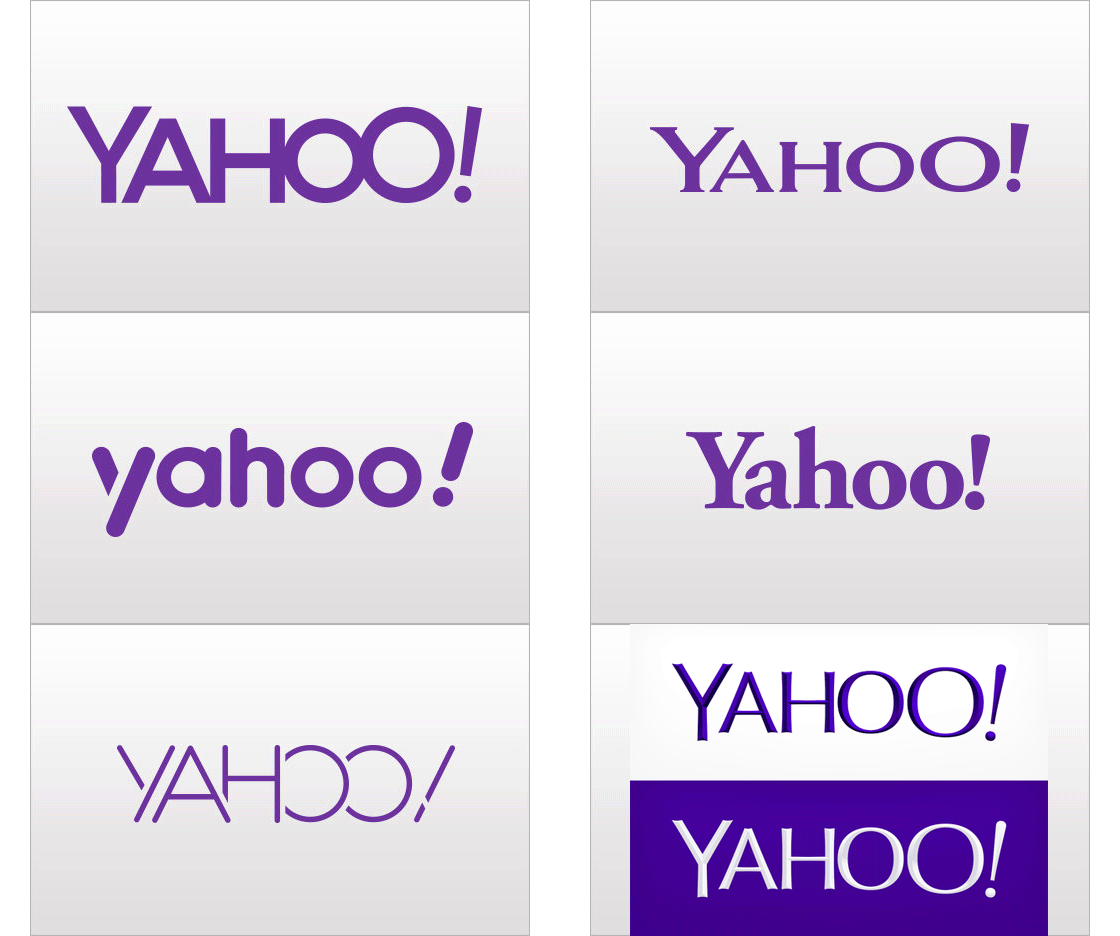
The announcement of the Yahoo new logo followed a 30 day logo campaign launched by the search directory. This campaign was given the name “30 Days Of Change”. On August 7th 2013 Yahoo announced that it would be unveiling variations on the now outdated logo. After this announcement, each day for the next thirty days the search directory’s homepage featured a unique logo variation. This campaign culminated in the unveiling of the new logo. To read more about Yahoo’s thirty day logo campaign, click here.
The final design was produced and designed exclusively by Yahoo’s in-house brand design group who worked closely with members of Yahoo’s product designers. Notably the Yahoo new logo did not feature as a day teaser during the 30 Days Of Change campaign.
