Flickr Redesign: New Developments since Google’s Loss – Marissa Mayer
Flickr Redesign

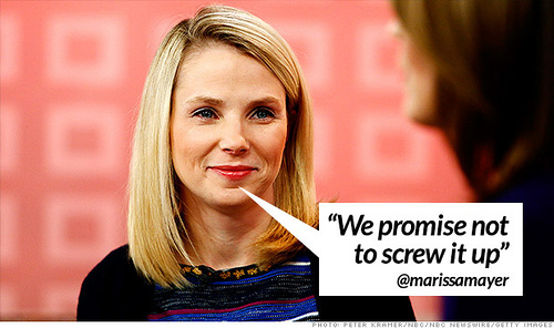
Soon after Marissa Mayer became CEO of the search engine, Yahoo in 2012, she was greeted with a Twitter based campaign. The campaign had one simple request, for a Flickr Redesign in the form of tweets such as “please make Flickr awesome again.” Yahoo was quick to respond to the demand to the Flickr redesign. A matter of months later the search engine provided users of the platform with a new iOS app. This move was followed up by a complete design overhaul at the beginning of 2013. Research conducted by Flickr found that the platform’s total number of users had substantially increased following the redesign. Outside opinions, however vary widely. Despite this the once vastly popular photo sharing based platform continues to grope forward.
The social media platforms latest development of Flickr redesign has come in the form of a photo page redesign. This development has been labelled the “new photo experience”. The change occurred early in October 2013 and continues to be rolled out gradually to all users. Under the changes in the redesign the photo is not shown at the top with a limited description provided beneath, which was historically out of sight and required users to scroll down in order to view this information. Instead, the photo is boldly shown in a large size, the image size has been increased by approximately 25%. If users wish to interact with the image they can easily do this by using the newly added sidebar. This sidebar removes scrolling through Flickr based interaction, the Flickr redesign makes the platform far more touch friendly, bringing it in line with the tablet revolution. Options which are included in this new sidebar enable users to view the EXIF metadata if they select to make this information available. The sidebar provides users with a vast amount of control options, including adding the image to favourites or sharing via other social media platforms. Additionally, user comments on an image are now listed with the newest appearing at the top and the oldest at the bottom.

After being neglected to the point of falling into disrepair under the former regime, Flickr appears to be making a comeback. It is still largely unknown what Yahoo’s and Mayer’s plan is, apart from closing the gap between Google and Facebook. But Flickr and images seem to play a significant role in these plans.
Despite these changes, not everyone is pleased. A faction has emerged which claims that under the changes Flickr is no longer as photographer focussed as it once was. Writing for the Huffington Post, Michael Stutz stated, “If Classic Flickr was an art gallery, where the focus is on individual works, their creators, and the community around them, New Flickr is a wall-to-wall comic strip, but without context or even a punch line.” He argues that under the changes the platform has lost its unique edge. Instead just becoming “a clone — a mash-up of Pinterest and Instagram, with a Facebook-style header at top.”
Stutz further claims that the manner in which the Flickr changes were deployed were “unkind”. He justifies this claim by pointing to the fact that there was no official warning, beta testing or open discussion about the upcoming changes. There seems to be a degree of truth to accusations made by Stutz. He points to the fact that the tens of thousands of accumulated complaints appeared on the platforms help forum which went completely unacknowledged by Yahoo. This silence seems to say that Yahoo is willing to reinvigorate and refresh Flickr, even if it means alienating their longest serving and most loyal users.
